Wednesday, November 26, 2014

3 Web Sites with Tables in Action

1. Tmobile.com - http://www.t-mobile.com/compare-phones.html
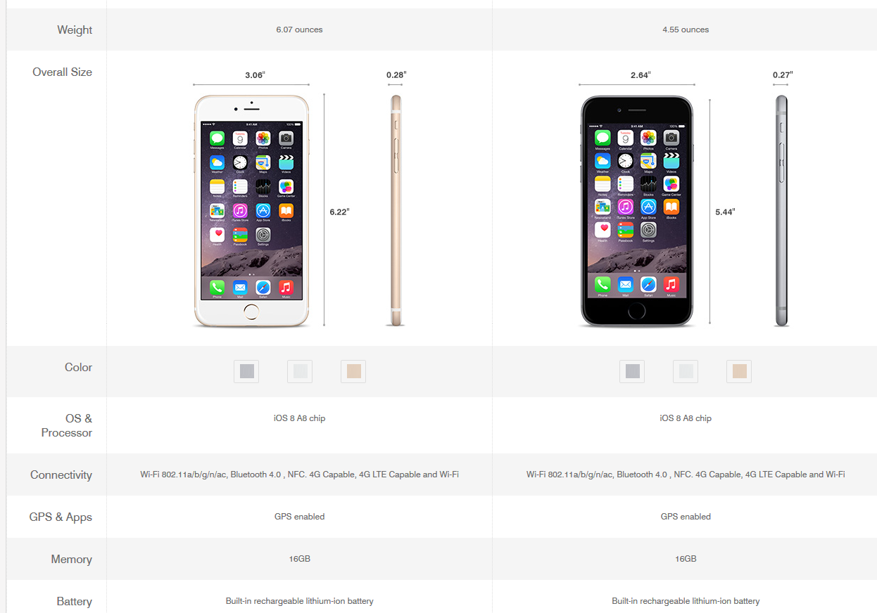
 I verified that T-mobile is using a table tag, they actually use <thead> but this phone comparison chart is made out of a table tag. I think it works perfectly for this scenario. Things are lined up perfectly, and they can use tags to add shadow to every other row like they did here which makes it easily viewable. Looks and functions well.


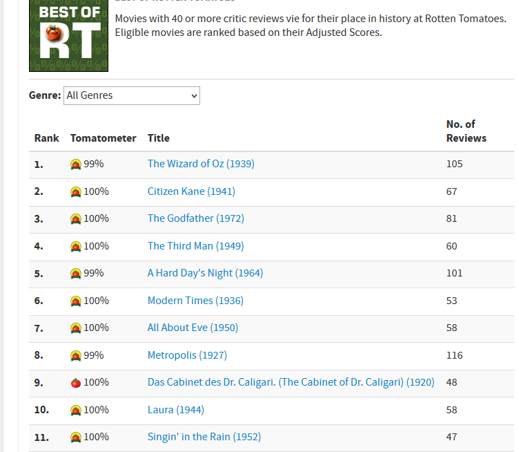
2.rotten tomatos - http://www.rottentomatoes.com/top/bestofrt/

I know we looked at this website in class but it took me going through tens and tens of websites to find one website that has a table in it. Looks like most websites use divs. I can see the value in using a table on the rotten tomatos website though. The layout is simple and the purpose of listing the top 100 movies is served. It's very easy to read and the shadowing on every other row adds to that. For this type of data, a table would be the easiest and most efficient way to go.


3. IMBD - http://www.imdb.com/chart/top

IMBD uses basically the same table layout as rotten tomatoes, used a shadowing on every other row for aesthetic purposes, which helps. Looks like they used a two column webpage overall and filled the left column with the table. Seems like an easy and efficient way to go. The information is given effectively. They don't need anything to look fancy. I guess that's the type of website/ situation where I have really noticed tables. In an information giving setting. Most of the retail sites I looked at all used divs instead of tables.


Wednesday, November 19, 2014

4 Web Sites Breaking a Usability Checklist Rule


1. Portland Farmer's Market - http://www.portlandfarmersmarket.org/ 


Usability Rule Broken:

A. Load Time. I literally hovered over 'community' and then clicked the 'videos' link and during the time the page was loading or attempting to load, I opened the snipping tool and took this snip... I just found this webpage extremely slow to load all pages.

B. Kuebler early learning, daycare - http://www.kueblerearlylearning.com/


Usability Rules Broken:
A. "Company logo is prominently Placed" - On this website which is for daycare between 6 weeks and 12yr old kids, there is a logo in the upper right corner of a butterfly.. which doesn't give us any information as to what the website is for and also, their company name, Kuebler Early Learning Daycare is no where to be found on their home page.

B. "Tagline makes companies purpose clear" - I guess their tagline is "Play..... Where Learning Begins!" This is the only thing I can see at the top but it doesn't make the companies purpose very clear to me. Is it a school or a daycare? or both?

I just thought overall, terrible branding on this page.

3. Pottery Fun - http://potteryfunpdx.com/Home_Page.html

Usability Rules Broken:
A. "Home-Page is digestible in 5 seconds" - The first thing I noticed when I came to this website was the partial face pic of the little girl drinking what looks like a root beer float. What on earth this has to do with creating your own pottery I couldn't tell you. This picture does not rotate. Below they show a picture of the front of the store, also not giving me much info on what their company is about. Once you start reading the info in the body of the page you start to get the gist however, not sure if I would have made it that far though if I was seriously interested...

B. "HTML page titles are explanatory" - When you're on this webpage, the page title says "Home Page"... yikes.

C. "Site load time is reasonable" - The site itself loaded pretty quickly, however, when you go to different links on the side they have a lot of pictures that load really slowly. It looks like they used small width and height dimensions on huge pics instead of using a program to condense the actual file size on these. Lots of waiting for picture loading overall makes this website not seem very professional.
 Overall, I thought this site could use a lot of work, based on the items I listed above, and also, they have a non-working home page link on their home page, Ok...

4. Best Martial Arts Institute - http://www.bmai.org/

Usability Rules Broken:

A. "Font size/spacing is easy to read" - The font on this page is way too small and there is little white space. People might not even bother.

B. "Home-Page is digestible in 5 seconds" - I felt physically overwhelmed when I looked at this website for too long. I would say that's a sign that it's not easily digestible. There is way too much text on this page! and It's not neatly arranged at all too make it even slightly user friendly. If they had maybe bordered things off, added some color or some sections for different info, then at least all of this info on the home page wouldn't look quite so bad.

C. "Navigation labels are clear and concise" - When I hover over 'schedule', there are
15 links coming down from it showing all the different levels of Aikido, Judo, and Karate. I think it would be a lot more concise if Judo, Aikido, and Karate were their own links and then a user could click on those to go another page showing the breakdowns of schedules.

Wednesday, November 12, 2014

4 Examples of Simple and Stylish Navigation Menus

4 Examples of Simple and Stylish Navigation Menus

1. tmobile.com 
 I go to this website a lot, because I used to work there, so I have noticed the easily usable navigation menus. I like that the outward links are descriptive and easily tell you what to expect. And what you see is what you get. 
2. ktvz.com
I go to ktvz.com alot to review the news and I have noticed their navigation menu. It's cool and noticeably different because when you hover over a main link, the ones that come down are horizontal, not vertical like a regular website. I thought this was pretty imaginative and creative.
3. espn.com
Espn.com is another site I go to on the regular Once you use the site once or twice, or anyone who has used internet on a regular basis can easily understand their navigation menus. I like that it's not just one of those navigation menus that has one link that leads to three drop down links. it leads to 15 other links but it keeps your scrolling and clicking majorly limited after that, which I can appreciate
4. cnn.com
I chose Cnn.com for my last link because of their somewhat unique navigation menu. Unlike most sites, where you hover over a link at the top and it shows you multiple other options as links within that category, CNN.com only has the inital links at the top. For example, you can click on Politics, Justice, or Entertainment as a link but you'll get no drop downs when you hover. I think this makes it really uncomplicated and takes the viewers exactly where they want to go.


Thursday, November 6, 2014

3 Web Sites and Their Wireframes

3 Web Sites and Their Wireframes


1. DrJays.com  -
I like this website to shop for clothes on. I can find stuff that I can't find locally and that not everyone else will have. There website looks and functions a lot like any other shopping site I have seen online. Such as Zappos, for example, where basically you'll have option bars on the left, for gender, size, price etc. The wireframe makes their website look kind of complicated but I don't think it would be very hard. 


2. Gmail.com
I use Gmail for my main email account so I thought it would be interesting to see what the wireframe would be like. I don't think the wireframe worked exactly right but I think it looks like a general 3 column webpage, with the right column being extremely narrow, the left somewhat narrow, and the main column being the main part of the webpage.

 3. MSN.com
My sister is on this website a lot to check the news and so it was up on my computer and  thought it would make a pretty cool, and complicated wireframe. I was right. There is a lot that goes into this website. It looks like a 5 column with some kind of div or section that fits in above the second and third columns which is pretty cool. Or maybe the large part to the right of the first column actually is part of the first column, just a large width... IDK but I like this layout.


Tuesday, October 28, 2014

3 Web Sites Where Images are the Star Attraction


3 Web Sites Where Images are the Star Attraction

1.Stockfreeimages.com at www.stockfreeimages.com/?gclid=CObE-L74z8ECFVKPfgodjXMA8A

I thought this website was great because it provides a lot of useful images for website backgrounds and they are all royalty-free. I think this site is a great resource for web developers looking for background images. They were all very different and although I think it would be hard to use some of them as a background, I think some web developers could find a way to use any of the pictures in a website with some imagination (like the picture I featured. Maybe by shifting the photo down, you would find some blank sky space at the top, but I think the pic is really pretty). It's nice to have lots of options.  I also liked how they categorized the photos into groups for quick browsing. 


2. National Geographics Website - http://photography.nationalgeographic.com/photography/photos/underwater-wrecks/

National Geographics website actually has some free to use background images that are designated for desktop backgrounds but could be used for website backgrounds as well. I found quite a few images here that I thought were really cool. The pictures were quality because they were national geographic and they were unusual, and refreshing. Lots with a lot of solid background space that would be good for websites. 
This one stuck out for me, I thought it was awesome. They have a whole section on underwater wrecks that were amazing. 
Photo: Sunken tugboat
Photo: Sunken Japanese plane


3.  Free Digital Photos - http://www.freedigitalphotos.net/

I thought this website was pretty cool. The main thing I noticed that stood out as different were the categories they had. Like holiday backgrounds, IE, the halloween one below. I think this website has a lot of backgrounds that are computer generated versus actual digital photos... (not sure why based on the name of the website) but I think that gives a lot of opportunity for a web developer to find something very specific. 
- This photo would be great to create a website for like a seasonal event, IE, a halloween party for a local business or company. It's simple, cool, and gives great blank space to include text. 

Mr Pumpkin Halloween Mask Stock Image


Monday, October 20, 2014

3 CSS Properties that Intrigue Me the Most

3 CSS Properties that Intrigue Me the Most:

1. p::first-letter

I viewed information about this first letter property from tutorialzine.com at the following link; http://tutorialzine.com/2013/10/12-awesome-css3-features-you-can-finally-use/    
I just think this one is pretty cool. I actually tried to use it for one of my previous web pages for this class and it didn't work. I think it's a cool feature that can add more style to any website. I really want to get it to work.

2. text-shadow  

I viewed a ton of text-shadow effects through the website line25.com at the link:
http://line25.com/articles/using-css-text-shadow-to-create-cool-text-effects 
I thought this text effect was awesome. The one I liked the most was the inset text
effect. I enjoy finding new ways to add text effects and think a website can be made really cool with mostly just text effects on a plain background. 

3. white-space  

The white space property seems really cool. I viewed info about it through smashingmagazine.com at the link: http://www.impressivewebs.com/css-white-space/
When I am making webpages using html in Notepad++, I tend to space things and use tabs to create the html to be more visually appealing. This seems to come naturally for me and a CSS property that will allow those spaces and tabs etc to happen as I type them would be really cool. There a lot of different white-space selectors, and I'd love to learn more about these.

Tuesday, October 14, 2014

  3 Online Resources for Learning More about CSS

Tizag - www.Tizag.com

 Tizag.com is a great site to learn CSS, especially if you are a beginner like I am.
 This site is awesome because it starts from step 1 and goes through tutorials to teach you how to learn, starting with copying a simple code in Notepad ++ and having you learn from there - hands on. The verbiage is simple, and the explanations precise.


2. Code Academy - www.CodeAcademy.com

I checked out and liked codeacademy.com because of how interactive it was. It's basically like taking an online class in how to learn HTML and CSS. It starts you at the beginning and on the left side of the page you will read and learn a certain task and then actually type it out in the middle with what appears to be an interactive notepad++. Then you can view if your code works through this site as well. 

http://cdn1.tnwcdn.com/wp-content/blogs.dir/1/files/2014/04/codecademy-learning-environment-3-730x356.png


3. html.net - www.html.net


 I liked the html.net website because the instructions were very basic. You can navigate through all the lessons on the left, go right to the part you want, and check out how to apply the code. For example, if I'm trying to just learn how to apply a background color, I click on 'colors and backgrounds' on the left and then 'background color' and it shows me how to apply it. Easy, good reference site. 


http://vanimg.s3.amazonaws.com/lwd-10.jpg