1. tmobile.com
I go to this website a lot, because I used to work there, so I have noticed the easily usable navigation menus. I like that the outward links are descriptive and easily tell you what to expect. And what you see is what you get.

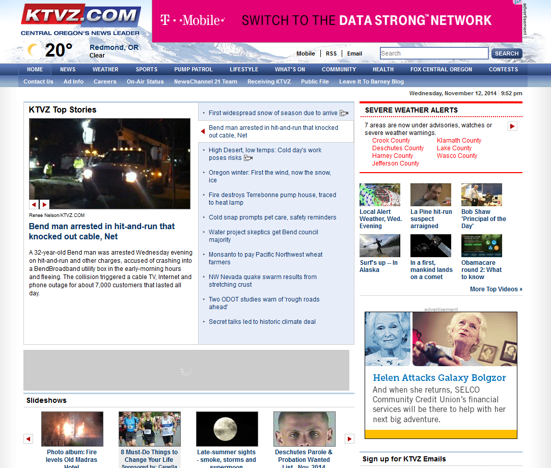
I go to ktvz.com alot to review the news and I have noticed their navigation menu. It's cool and noticeably different because when you hover over a main link, the ones that come down are horizontal, not vertical like a regular website. I thought this was pretty imaginative and creative.
Espn.com is another site I go to on the regular Once you use the site once or twice, or anyone who has used internet on a regular basis can easily understand their navigation menus. I like that it's not just one of those navigation menus that has one link that leads to three drop down links. it leads to 15 other links but it keeps your scrolling and clicking majorly limited after that, which I can appreciate

I chose Cnn.com for my last link because of their somewhat unique navigation menu. Unlike most sites, where you hover over a link at the top and it shows you multiple other options as links within that category, CNN.com only has the inital links at the top. For example, you can click on Politics, Justice, or Entertainment as a link but you'll get no drop downs when you hover. I think this makes it really uncomplicated and takes the viewers exactly where they want to go.

No comments:
Post a Comment