1. Portland Farmer's Market - http://www.portlandfarmersmarket.org/

Usability Rule Broken:
A. Load Time. I literally hovered over 'community' and then clicked the 'videos' link and during the time the page was loading or attempting to load, I opened the snipping tool and took this snip... I just found this webpage extremely slow to load all pages.
B. Kuebler early learning, daycare - http://www.kueblerearlylearning.com/
Usability Rules Broken:
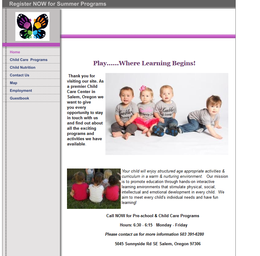
A. "Company logo is prominently Placed" - On this website which is for daycare between 6 weeks and 12yr old kids, there is a logo in the upper right corner of a butterfly.. which doesn't give us any information as to what the website is for and also, their company name, Kuebler Early Learning Daycare is no where to be found on their home page.
B. "Tagline makes companies purpose clear" - I guess their tagline is "Play..... Where Learning Begins!" This is the only thing I can see at the top but it doesn't make the companies purpose very clear to me. Is it a school or a daycare? or both?
I just thought overall, terrible branding on this page.
3. Pottery Fun - http://potteryfunpdx.com/Home_Page.html

A. "Home-Page is digestible in 5 seconds" - The first thing I noticed when I came to this website was the partial face pic of the little girl drinking what looks like a root beer float. What on earth this has to do with creating your own pottery I couldn't tell you. This picture does not rotate. Below they show a picture of the front of the store, also not giving me much info on what their company is about. Once you start reading the info in the body of the page you start to get the gist however, not sure if I would have made it that far though if I was seriously interested...
B. "HTML page titles are explanatory" - When you're on this webpage, the page title says "Home Page"... yikes.
C. "Site load time is reasonable" - The site itself loaded pretty quickly, however, when you go to different links on the side they have a lot of pictures that load really slowly. It looks like they used small width and height dimensions on huge pics instead of using a program to condense the actual file size on these. Lots of waiting for picture loading overall makes this website not seem very professional.
Overall, I thought this site could use a lot of work, based on the items I listed above, and also, they have a non-working home page link on their home page, Ok...
4. Best Martial Arts Institute - http://www.bmai.org/
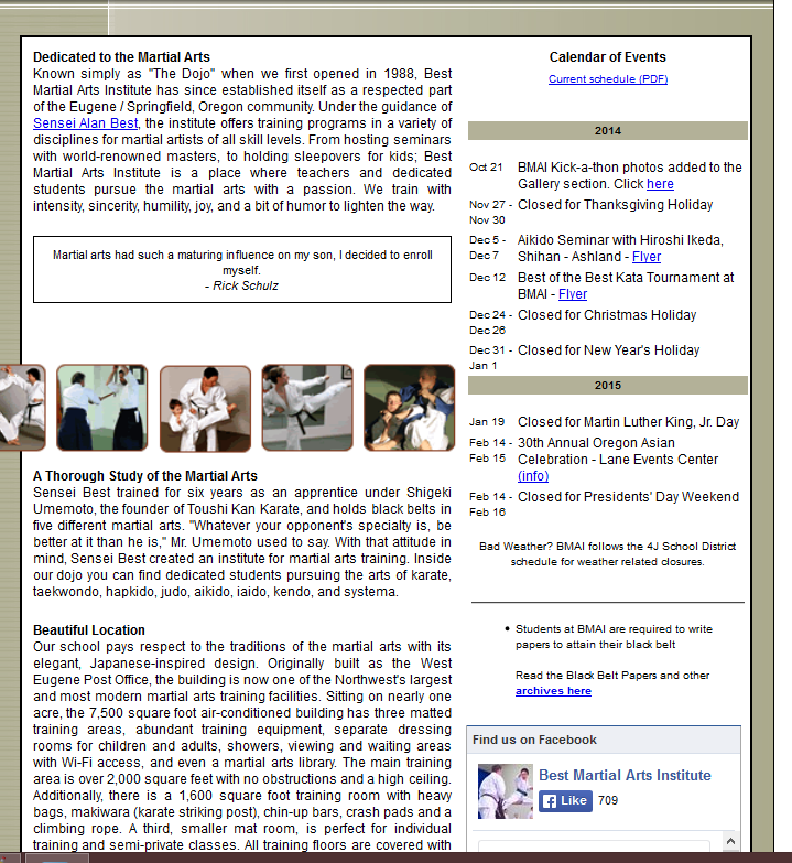
A. "Font size/spacing is easy to read" - The font on this page is way too small and there is little white space. People might not even bother.
B. "Home-Page is digestible in 5 seconds" - I felt physically overwhelmed when I looked at this website for too long. I would say that's a sign that it's not easily digestible. There is way too much text on this page! and It's not neatly arranged at all too make it even slightly user friendly. If they had maybe bordered things off, added some color or some sections for different info, then at least all of this info on the home page wouldn't look quite so bad.
C. "Navigation labels are clear and concise" - When I hover over 'schedule', there are
15 links coming down from it showing all the different levels of Aikido, Judo, and Karate. I think it would be a lot more concise if Judo, Aikido, and Karate were their own links and then a user could click on those to go another page showing the breakdowns of schedules.
No comments:
Post a Comment